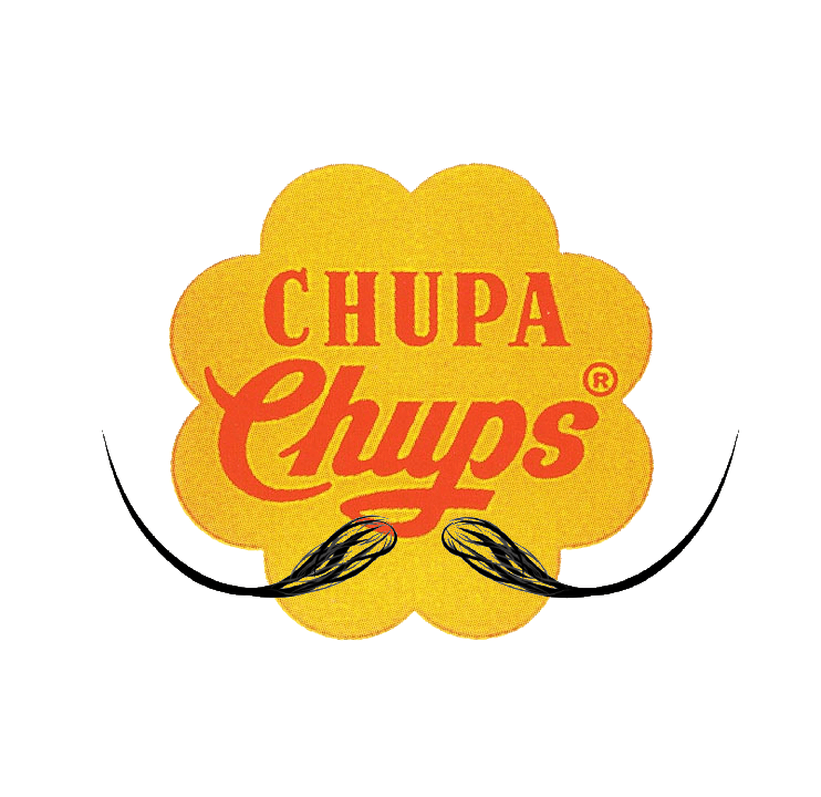
Dali & Chupa Chups
First things first: did you know that Chupa Chups is a Spanish confectionery brand? With that info,
it's no wonder Dali was the one to design the logo :)
The company was founded in 1958 by Enric Bernat. Can you guess how it got its name?
From the Spanish verb chupar, which means, wait for it, to suck. Pun intended much? :D
Wait! It gets worse! The company's first marketing campaign featured the logo with the slogan
“És rodó i dura molt, Chupa Chups,” which translates from Catalan, “It's round and long-lasting.”
More on these things at the bottom of the text.
Now, Bernat and Dali were buddies, and in 1969, Bernat was complaining to Dali about the branding over coffee.
Dali was like, "Bro, leave it to me." He was sketching for a bit—on a napkin!—and then drew the daisy-shaped logo.
It took an hour. Enric happily paid a multimillion-dollar fee. Aaaaand that says a lot about different prices
per hour. Dali suggested that the best place for the logo would be on top of the lolly so the logo wouldn't
lose its shape.
As I promised, more about the marketing of Chupa Chups.
The company had an idea to attract adult customers through an anti-smoking campaign.
They made a parody out of it with the slogan 'Stop smoking, start sucking'
and the packaging was designed to look like cigarette packs. Some even had black-and-white labels saying
'Sucking does not kill.'
Knowing all this, it's not surprising that Bernat and Dali were good friends.
They were on the same page and both knew how to do marketing and make people laugh.